Android 17’s New Media Player Panel: Ending Accidental Swipes Forever



Android 17’s New Media Player Panel: Ending Accidental Swipes Forever
Say goodbye to random track skips with Android 17’s redesigned media player panel — smoother switching and smarter controls are finally here.
How Many Times Did You Accidentally Skip a Track Last Month?
If you’ve ever tried to switch apps from the notification shade only to find your music suddenly jumping around, you know the frustration all too well. For years, Android users have vented about this clunky behavior: the media player carousel in the notification panel was neat—until you had a couple of audio apps running simultaneously. Then it became a swiper’s nightmare.
Cards Replace the Carousel: A Fresh Take on Media Controls
Google dropped a surprise update with Android 17 QPR1 Beta 3 at I/O 2026, and one of the quiet MVPs of this release is the revamped media player interface.
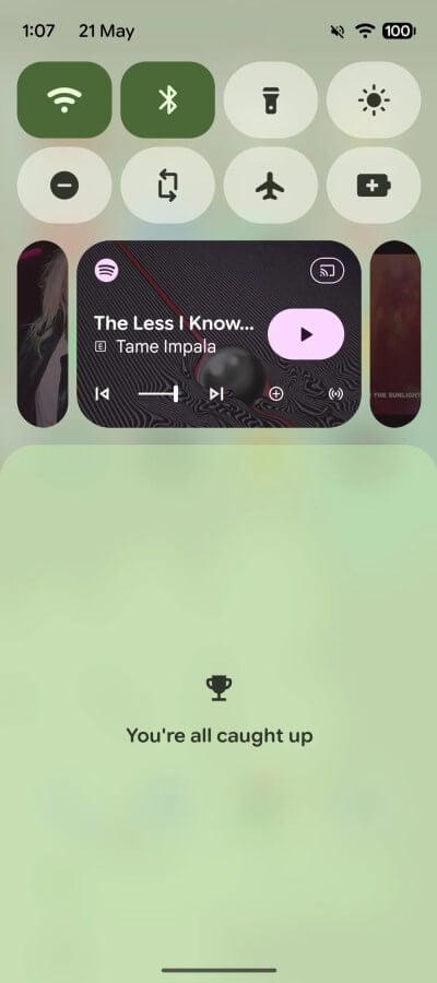
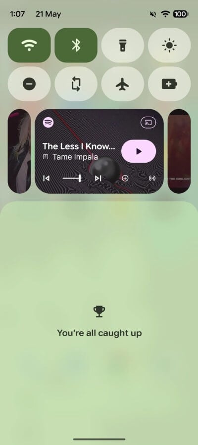
New Android 17 media player panel in the notification shade — cards over carousel
Gone is the familiar swipe carousel, replaced by a sleek Material 3-inspired design that appears on both the lock screen and notification shade. It might sound like a minor tweak, but this little detail is the heart of the update.
The active player now takes center stage in the playback panel, while inactive or paused sessions shrink down into small pill-shaped cards hugging the edges, left and right.
This layout directly tackles a major pain point: previously, swipe gestures to fast-forward or rewind often led to accidental track skips when trying to switch apps. The new design minimizes those mishaps.
Plus, instead of swiping, you can just tap a side card to switch between apps — one deliberate tap, zero misses.
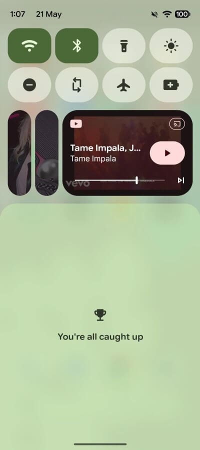
Quick tap to switch media apps? Yes, please
Early testers have mixed feelings though. The new layout shines when exactly three media apps are queued up. With two, the side cards look a bit lopsided, and when there’s only one active source, those cards don’t really serve a purpose.
There’s a trade-off: the compact cards eat up extra space, making the main player panel smaller. Playback control buttons have shrunk too, which has drawn some criticism from folks with smaller screens.
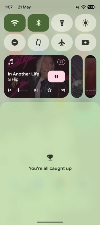
Smaller playback buttons on the compacted player panel
More Than Just the Media Player: Other New Bits in QPR1 Beta 3
The new player isn’t flying solo in this update. Android 17 keeps moving towards that frosted glass aesthetic we swooned over in Material You, adding blur and translucency to the power menu and quick settings.
There’s also a fresh bounce animation in quick settings that’s eerily reminiscent of the iPhone’s interface — a second nod to Apple’s influence in Android 17 that’s hard to miss for anyone who’s held both phones.
Screen recording got a tiny but handy upgrade too: it remembers the last app you recorded from, saving you a trip back into the menu every time.
For the power users, a “Continue On” feature is lurking in the firmware, letting you seamlessly transfer Chrome tabs from your phone to a tablet. It’s still early days with no full interface, but the direction is clear and exciting.
Since QPR builds preview Pixel Feature Drops, expect these features to make their way into a stable release around September. The media player’s final form might even see some button size tweaks by then.
Pricing and Availability Snapshot
While the Google Pixel 8 Pro smartphone isn’t officially sold in some markets, it’s still findable on various marketplaces. Prices hover around $550 for the 12/128 GB version and up to about $650 for the 12/256 GB SKU, depending on the seller and deals. Warranty terms vary since there’s no official service center in some regions.
Beta Program and What to Expect
The Android beta program is open worldwide without restrictions. Owners of Pixel 6 and newer can grab QPR1 Beta 3 via OTA updates. Google services run smoothly, no extra hacks needed.
Just a heads-up: installing beta builds on your main phone can lead to some bugs — app crashes, higher battery drain, occasional glitches. If your Pixel is your daily driver, waiting for the official Feature Drop in September might be the safer bet.
Should You Give Android 17 Beta a Spin?
Pros:
- Tap to switch between media apps — no more accidental swipes
- Protection against unintentional track scrubbing
- Fresh Material 3-inspired look
- Enhanced animations and improved screen recording
Cons:
- Smaller pause and skip buttons
- Side cards eat up space on small screens
- Beta bugs and app instability
Verdict: If your patience with the old carousel was running thin, you’ll likely appreciate this smarter layout. But don’t rush to install the beta just for this. The stable September update promises the same improvements with refined button sizes. That’s the moment to upgrade confidently.
The End of Hidden Interfaces: A Win for Predictability
Let’s circle back to where we started — why does a simple mis-tap in the notification shade feel so maddening? Because music controls should work without second-guessing. For years, the industry chased minimalist screens, hiding controls behind gestures. Looks nice, but leaves you blind.
Bringing back visible cards and explicit taps isn’t a step backward. It’s a genuine admission: people need to see what they’re controlling. A predictable tap beats a pretty yet unpredictable gesture every time. And the fact Google finally gets this? That’s way more interesting than just another icon redesign.
“A predictable tap always wins over a beautiful but unpredictable gesture.”
— Android 17 Media Player Insight
FAQ
- How does the new player panel minimize accidental track skips?
By replacing swipe gestures with tappable cards on the sides, it reduces unintentional fast-forwards or rewinds when switching apps. - Can I still swipe to change tracks in Android 17?
No, the swipe carousel is replaced by card taps for better precision. - Is the new media player available on all Android phones?
Currently, it’s part of Android 17 QPR1 Beta 3 for Pixel 6 and newer devices. - Does the new media player take up more space in the notification shade?
The side cards do use additional space, making the main playback panel more compact. - Will the final release fix the smaller buttons and layout quirks?
Google aims to refine these elements for the stable Feature Drop expected in September.
Ready to surround yourself with the vibes of your favorite albums? Shop stunning album cover posters at our store and bring your music space to life: Architeg Prints.
 | DISCOUNTGET 30% OFF*Use code on your next order:
|
* This post may contain affiliate links, meaning we earn a commission if you make a purchase through these links, at no additional cost to you.